android-simple-tooltip
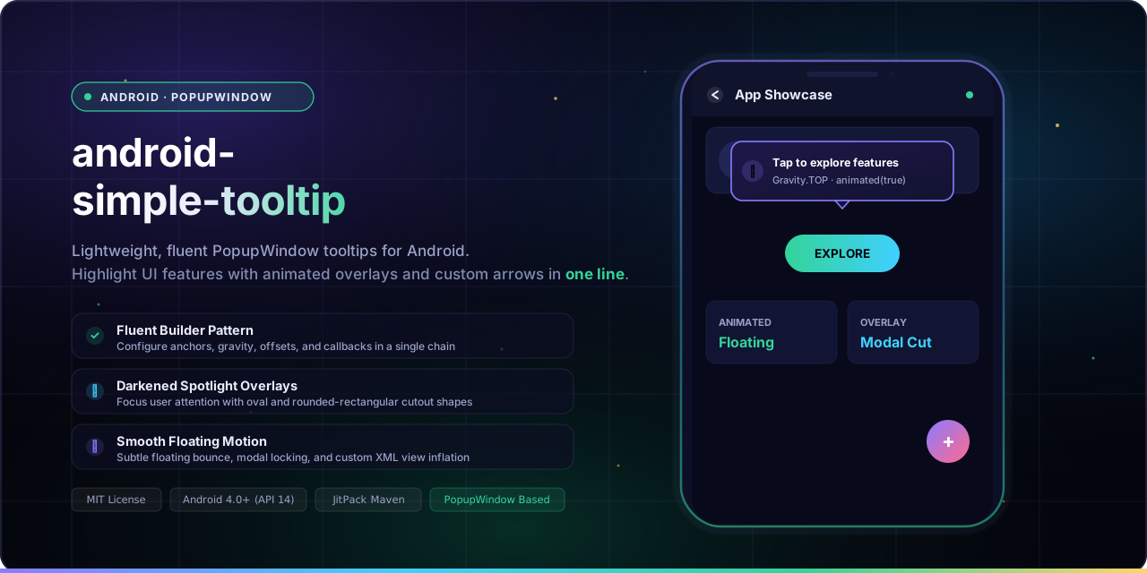
A simple library based on PopupWindow to create customizable tooltips on Android.
Android Simple Tooltip is a lightweight and easy-to-use library based on PopupWindow to create flexible, animated tooltips, guided tours, and onboarding hints on Android with a clean, fluent Builder API.






Quick Start · Why · Demo · Installation · Usage · Resources · API Reference · Known Issues · Contributing
Add JitPack repository to your root build.gradle:
allprojects {
    repositories {
        google()
        mavenCentral()
        maven { url 'https://jitpack.io' }
    }
}
Add the dependency to your module app/build.gradle:
dependencies {
    implementation 'com.github.douglasjunior:android-simple-tooltip:1.1.0'
}
Show a tooltip anchored to any View with a single chained call:
View yourView = findViewById(R.id.your_view);

new SimpleTooltip.Builder(this)
    .anchorView(yourView)
    .text("Welcome to the new feature!")
    .gravity(Gravity.BOTTOM)
    .animated(true)
    .transparentOverlay(false)
    .build()
    .show();
💡 Why Android Simple Tooltip?
- 🎯 Fluent Builder Pattern. Configure anchors, gravities, colors, offsets, and callbacks in a single chained statement.
- ⚡ Lightweight & Independent. Built on standard Android
PopupWindow, requiring zero heavy third-party dependencies. - 🎬 Smooth Floating Animations. Configurable subtle floating motion with custom duration and translation distance.
- 🔍 Spotlight Backdrop Overlays. Focus user attention with dimmed backgrounds featuring oval or rounded-rectangular spotlight cutouts.
- 🎛️ Granular Dismiss Control. Dismiss on touch inside, touch outside, or block background interactions in modal mode.
- 📐 Customizable Shapes & Arrows. Control arrow dimensions, direction, colors, or substitute your own custom drawable.
- 🧩 Inflatable Custom Layouts. Inflate complex XML layouts with custom buttons, inputs, and interactive views inside the tooltip.
- 🎨 Deep Resource Theming. Override styling globally via XML dimensions, colors, and styles without touching Java code.
📸 Demo
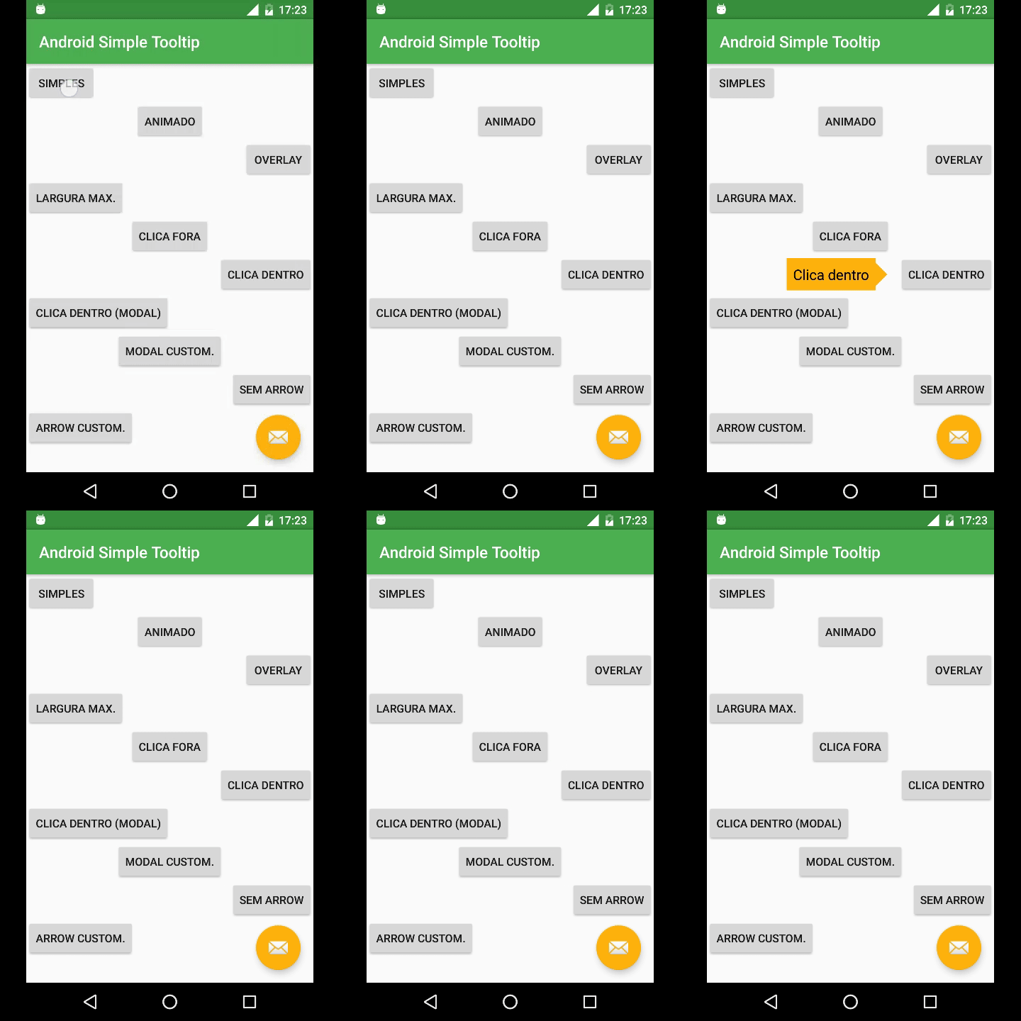
Explore the complete sample app in the sample directory.
📦 Installation
1. Configure Repository
Add JitPack to your root build.gradle at the end of repositories:
allprojects {
    repositories {
        google()
        mavenCentral()
        maven { url 'https://jitpack.io' }
    }
}
[!NOTE] For projects using Gradle 7+ with
dependencyResolutionManagementinsettings.gradle:dependencyResolutionManagement { repositoriesMode.set(RepositoriesMode.FAIL_ON_PROJECT_REPOS) repositories { google() mavenCentral() maven { url 'https://jitpack.io' } } }
2. Add Dependency
Stable Release
dependencies {
    implementation 'com.github.douglasjunior:android-simple-tooltip:1.1.0'
}
Development Snapshot
To use the latest snapshot build from the master branch:
dependencies {
    implementation('com.github.douglasjunior:android-simple-tooltip:master-SNAPSHOT') {
        changing = true // Gradle will check for updates every 24 hours
    }
}
💻 Usage & Examples
1. Basic Tooltip
Anchors to a target view and displays a simple message:
View yourView = findViewById(R.id.your_view);

new SimpleTooltip.Builder(this)
    .anchorView(yourView)
    .text("Hello World!")
    .gravity(Gravity.END)
    .build()
    .show();
2. Animated Floating Tooltip
Enables a smooth bouncing translation animation:
new SimpleTooltip.Builder(this)
    .anchorView(yourView)
    .text(R.string.tip_text)
    .gravity(Gravity.TOP)
    .animated(true)
    .animationDuration(1000)
    .animationPadding(SimpleTooltipUtils.pxFromDp(6))
    .build()
    .show();
3. Spotlight Backdrop Overlay
Darkens the surrounding screen while highlighting the anchor view with an oval or rounded-rectangular spotlight:
new SimpleTooltip.Builder(this)
    .anchorView(yourView)
    .text("Focus attention on this element")
    .gravity(Gravity.START)
    .animated(true)
    .transparentOverlay(false)
    .highlightShape(OverlayView.HIGHLIGHT_SHAPE_RECTANGULAR_ROUNDED)
    .cornerRadius(20)
    .overlayOffset(0)
    .overlayWindowBackgroundColor(Color.BLACK)
    .build()
    .show();
4. Modal Mode & Dismissal Rules
Prevent users from interacting with the background while the tooltip is visible:
new SimpleTooltip.Builder(this)
    .anchorView(yourView)
    .text("Modal tooltip: tap inside to dismiss")
    .gravity(Gravity.BOTTOM)
    .modal(true)
    .dismissOnInsideTouch(true)
    .dismissOnOutsideTouch(false)
    .build()
    .show();
5. Custom Inflatable XML Layout
Inflate a custom layout with custom views, action buttons, or text fields:
final SimpleTooltip tooltip = new SimpleTooltip.Builder(this)
    .anchorView(yourView)
    .gravity(Gravity.TOP)
    .modal(true)
    .animated(true)
    .contentView(R.layout.tooltip_custom, R.id.tv_text)
    .focusable(true)
    .build();

// Access views inside the custom layout
Button btnNext = tooltip.findViewById(R.id.btn_next);
EditText edText = tooltip.findViewById(R.id.ed_text);

btnNext.setOnClickListener(v -> {
    tooltip.dismiss();
    // Do something with edText.getText()
});

tooltip.show();
6. Custom Arrow Direction & Icon
Customize or remove the indicator arrow:
// Without arrow
new SimpleTooltip.Builder(this)
    .anchorView(yourView)
    .text("No arrow")
    .gravity(Gravity.CENTER)
    .showArrow(false)
    .build()
    .show();

// Custom arrow drawable and size
new SimpleTooltip.Builder(this)
    .anchorView(yourView)
    .text("Custom arrow")
    .gravity(Gravity.END)
    .arrowDrawable(R.drawable.ic_custom_arrow)
    .arrowWidth(SimpleTooltipUtils.pxFromDp(32))
    .arrowHeight(SimpleTooltipUtils.pxFromDp(32))
    .build()
    .show();
7. Inside Dialogs or DialogFragments
When showing tooltips inside a dialog, set overlayMatchParent(false) so the overlay respects the dialog's bounds:
new SimpleTooltip.Builder(activity)
    .anchorView(btnInDialog)
    .text("Tip inside a Dialog")
    .gravity(Gravity.BOTTOM)
    .animated(true)
    .transparentOverlay(false)
    .overlayMatchParent(false)
    .build()
    .show();
🎨 Customization & Resources
You can override default styling globally across your app by defining these resources in your project's res/values/:
Colors (res/values/colors.xml)
<resources>
    <!-- Tooltip bubble background color -->
    <color name="simpletooltip_background">@color/colorAccent</color>
    <!-- Tooltip default text color -->
    <color name="simpletooltip_text">@android:color/primary_text_light</color>
    <!-- Indicator arrow color -->
    <color name="simpletooltip_arrow">@color/colorAccent</color>
</resources>
Dimensions (res/values/dimens.xml)
<resources>
    <dimen name="simpletooltip_overlay_offset">10dp</dimen>
    <dimen name="simpletooltip_margin">10dp</dimen>
    <dimen name="simpletooltip_padding">8dp</dimen>
    <dimen name="simpletooltip_arrow_width">30dp</dimen>
    <dimen name="simpletooltip_arrow_height">15dp</dimen>
    <dimen name="simpletooltip_animation_padding">4dp</dimen>
</resources>
Integers (res/values/integers.xml)
<resources>
    <!-- Overlay backdrop darkness (0 to 255) -->
    <integer name="simpletooltip_overlay_alpha">120</integer>
    <!-- Duration of one animation cycle in milliseconds -->
    <integer name="simpletooltip_animation_duration">800</integer>
</resources>
Styles (res/values/styles.xml)
Override simpletooltip_default in your app to customize default text appearance (the library style inherits @android:style/TextAppearance.Medium):
<resources>
    <style name="simpletooltip_default" parent="@android:style/TextAppearance.Medium">
        <!-- Example text appearance customizations -->
        <item name="android:textSize">14sp</item>
        <item name="android:textColor">@color/simpletooltip_text</item>
    </style>
</resources>
📚 API Reference
SimpleTooltip.Builder Methods
| Method | Type / Parameter | Default | Description |
|---|---|---|---|
anchorView(View) |
View |
Required | Target view that the tooltip will point to. |
text(CharSequence) |
CharSequence |
"" |
Text displayed in the tooltip. |
text(@StringRes int) |
int |
String resource ID for the tooltip text. | |
gravity(int) |
Gravity.TOP / BOTTOM / START / END / CENTER |
Gravity.BOTTOM |
Side relative to the anchor where the tooltip appears. |
animated(boolean) |
boolean |
false |
Enables floating bounce animation (API 11+). |
animationDuration(long) |
long (ms) |
800 |
Duration of each animation cycle. |
animationPadding(float) |
float / @DimenRes int |
4dp |
Travel distance of the animation in pixels. |
transparentOverlay(boolean) |
boolean |
true |
When false, darkens the screen backdrop with a spotlight. |
highlightShape(int) |
OverlayView.HIGHLIGHT_SHAPE_* |
OVAL |
Shape of the spotlight cutout (OVAL, RECTANGULAR, RECTANGULAR_ROUNDED). |
cornerRadius(float) |
float |
0 |
Corner radius for rounded rectangular spotlight cutouts. |
overlayOffset(float) |
float (px) |
10dp |
Extra spacing between the anchor view and the spotlight cutout edge. |
overlayWindowBackgroundColor(int) |
@ColorInt int |
Color.BLACK |
Base color of the darkened backdrop overlay. |
overlayMatchParent(boolean) |
boolean |
true |
Set to false for dialogs/fragments so the overlay fits the dialog bounds. |
ignoreOverlay(boolean) |
boolean |
false |
Completely skips adding the overlay view to the root view hierarchy. |
modal(boolean) |
boolean |
false |
Blocks touch events on background views while the tooltip is open. |
dismissOnInsideTouch(boolean) |
boolean |
true |
Dismisses the tooltip when clicked inside its bubble. |
dismissOnOutsideTouch(boolean) |
boolean |
true |
Dismisses the tooltip when clicked outside its bubble. |
showArrow(boolean) |
boolean |
true |
Whether to display the indicator arrow. |
arrowDirection(int) |
ArrowDrawable.* |
AUTO |
Arrow direction (AUTO, TOP, BOTTOM, LEFT, RIGHT). |
arrowColor(int) |
@ColorInt int |
Resource default | Tint color for the default arrow drawable. |
arrowDrawable(Drawable) |
Drawable / @DrawableRes int |
Default shape | Custom drawable used as the indicator arrow. |
arrowWidth(float) |
float |
30dp |
Arrow base width in pixels. |
arrowHeight(float) |
float |
15dp |
Arrow height in pixels. |
contentView(View, int) |
View, @IdRes int |
Default TextView | Custom view with an optional text view ID. |
contentView(@LayoutRes int, int) |
int, @IdRes int |
Layout resource to inflate with an optional text view ID. | |
backgroundColor(int) |
@ColorInt int |
Resource default | Background color of the default content bubble. |
textColor(int) |
@ColorInt int |
Resource default | Text color for the default text view. |
maxWidth(float) |
float / @DimenRes int |
0 (unlimited) |
Maximum width constraint for the tooltip bubble. |
margin(float) |
float / @DimenRes int |
10dp |
Margin between the anchor view and the tooltip bubble. |
padding(float) |
float / @DimenRes int |
8dp |
Internal padding within the tooltip bubble. |
focusable(boolean) |
boolean |
Non-touch: true |
Enables keyboard/D-pad navigation focus on non-touch devices. |
onDismissListener(listener) |
OnDismissListener |
null |
Callback invoked when the tooltip is dismissed. |
onShowListener(listener) |
OnShowListener |
null |
Callback invoked when the tooltip is displayed. |
build() |
SimpleTooltip |
Validates parameters and constructs the SimpleTooltip instance. |
SimpleTooltip Instance Methods
| Method | Return Type | Description |
|---|---|---|
show() |
void |
Displays the tooltip on screen anchored to the configured view. |
dismiss() |
void |
Dismisses and cleans up the tooltip, overlay, and animations. |
isShowing() |
boolean |
Returns true if the tooltip popup is currently visible. |
findViewById(@IdRes int id) |
<T extends View> T |
Finds a view within the tooltip's inflated content layout. |
Check the Javadoc documentation for full class references.
Platform Notes & Known Issues
IllegalArgumentException: Could not lock surface- Cause: Occurs if a hosting
ActivityorDialogis closed while the tooltip's floating animation is still running. - Impact: Does not crash or impact app stability. The library automatically catches and cleans up listeners upon dismissal.
- Cause: Occurs if a hosting
android.view.WindowLeaked- Cause: Occurs if
tooltip.show()is triggered after the parentActivityhas already begun finishing or destroying. Refer to the StackOverflow discussion. - Prevention: Always check
!isFinishing()or dismiss the tooltip in youronDestroy()/onStop()lifecycle callback.
- Cause: Occurs if
PopupWindow.setClippingEnabledon Android 7.0+ (API 24+)- Cause: Beginning in Android Nougat (API 24), the platform modified how
PopupWindowclips contents against screen boundaries, which may crop popups near the edges. - Workaround: Adjust margin offsets or refer to Issue #40 for specific boundary handling.
- Cause: Beginning in Android Nougat (API 24), the platform modified how
🤝 Contributing
Contributions, bug reports, and pull requests are warmly welcomed!
- Read the sample project and inspect
SimpleTooltip.java. - Fork the repository and create your topic branch (
git checkout -b feature/my-feature). - Verify that Gradle build and checks pass:
./gradlew build connectedCheck - Open a pull request describing your improvements.
For questions and suggestions, please open an Issue.
Support the Author
If this library helped your project, consider supporting the maintainer:


⭐ Star History
📄 License
The MIT License (MIT)

Copyright (c) 2016 Douglas Nassif Roma Junior
See the full LICENSE file for details.
🌐 Author & More Projects
Discover more open-source libraries, creative animation engines, and developer tools at douglasjunior.work.