constraints-explorer
A lightweight tool to help understand and debug how Compose's layout constraints affect your composables. It's intended to use in previews and lets you adjust the constraints interactively:
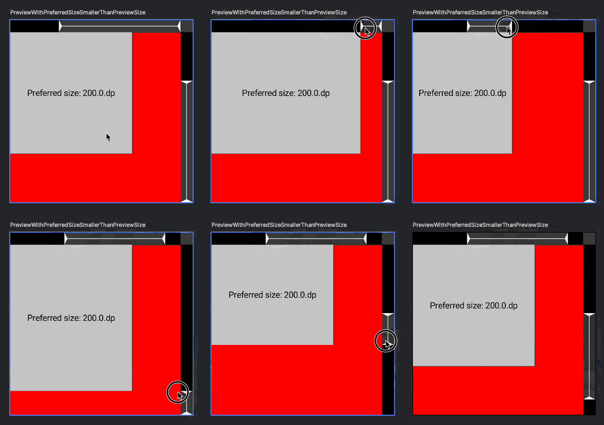
To learn more about Compose's layout system and the role of constraints, see the documentation on Developer Android.
Usage
To use it, first add the dependency:
implementation("com.zachklipp:constraints-explorer:{version}")
Note that for now, this is an Android-only library, since it's intended to be used with Android Studio's preview feature. However, I'm open to making it Compose Multiplatform eventually.
Then, assuming your project has some @Previews, wrap the contents of a preview with the
ConstraintsExplorer composable:
@Preview
@Composable
private fun YourComposablePreview() {
  ConstraintsExplorer {
    // Your preview code goes here.
    YourComposable()
  }
}
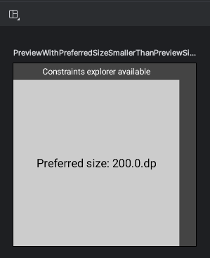
Refresh the preview, and you should see your composable with a gray bar on the top and the right of the preview frame, and a label that says “Constraint explorer available”.
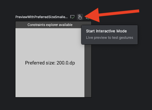
To get the interactive preview, simply enter the preview's “Interactive mode” by clicking on this button:
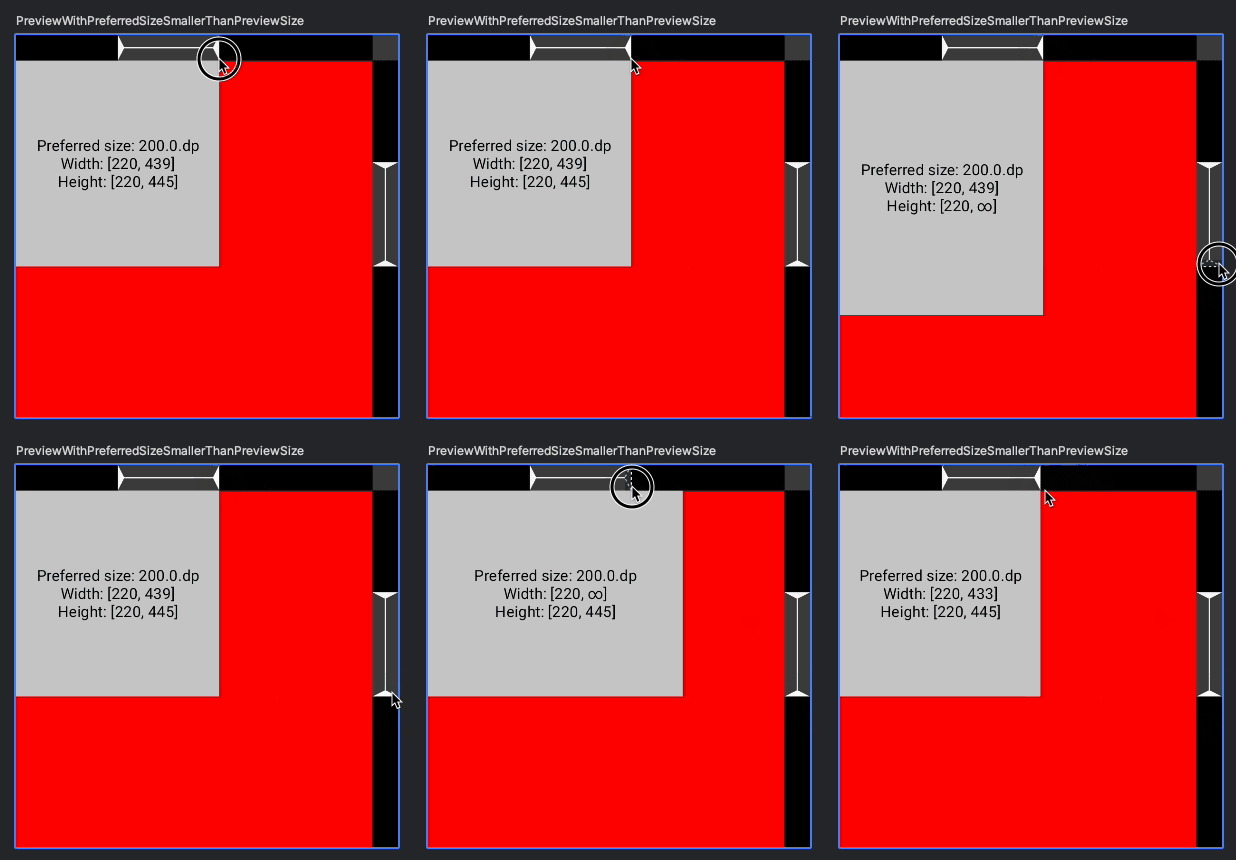
The gray bars around your preview will get some triangles. These represent the minimum and maximum constraints that get passed to your composable's layout. You can drag these triangles around to adjust the constraints and see your composable react in real-time.
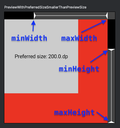
In interactive mode, the preview will expand to fill the maximum constraints of the preview area. The constraints explorer does not draw anything behind your component. In the above screenshot, the preview is configured with a red background to highlight where the actual component bounds are.
By default, ConstraintsExplorer won't do anything when not running in a preview. This probably
won't matter if you only use this composable in your @Preview functions, but it also means that
if you're using your previews for tests (e.g. snapshot tests with Paparazzi), it won't show up in
those tests. You can override this behavior by passing the enabled flag to ConstraintsExplorer.
Unbounded maximum constraints
Clicking on a maximum constraint handle will toggle whether that constraint is “unbounded”. An
unbounded maximum constraint has value Constraints.Infinity and is indicated by the arrow being
drawn with a dotted outline. Dragging an unbounded handle will re-enable its bound automatically.
A note on fillMax* modifiers in previews
If you're passing any size-related modifier to the root composable inside your preview, you might
want to move it to ConstraintsExplorer instead. It won't affect the static preview and it allows
the explorer to actually “explore” more of your component.
E.g. if you have this:
@Preview
@Composable
private fun YourComposablePreview() {
  ConstraintsExplorer {
    YourComposable(Modifier.fillMaxSize())
  }
}
consider changing it to this:
@Preview
@Composable
private fun YourComposablePreview() {
  ConstraintsExplorer(Modifier.fillMaxSize()) {
    YourComposable()
  }
}
If you're just setting the size to an exact size, you can also do that by passing widthDp and
heightDp parameters to the @Preview annotation itself.
If you're modifying the size (or more precisely, the constraints) of your composable inside the
ConstraintsExplorer, then when you're playing with the sliders in interactive mode you won't get
to see how your unmodified component reacts; you'll be seeing how it reacts with the additional
constraints modifier. That isn't very useful, since that modifier is only applied in the preview.
ConstraintsExplorer will always fill all available space in interactive mode in order to allow you
to modify the min/max constraints within that space and it doesn't modify the constraints at all in
non-interactive mode. So moving size modifiers to ConstraintsExplorer won't change the
non-interactive preview but allows your component to see and react to the constraints you can adjust
in interactive mode.
For example, when you have fillMaxSize inside ConstraintsExplorer, your composable will ignore
the incoming minimum constraints (the arrows pointing right and down), so moving those sliders won't
have any effect, and you're not going to see how your unmodified component will actually behave in
other contexts. If your component itself always fills available space, then this won't make any
difference but then using fillMaxSize in your preview is redundant anyway.
Motivation
This tool was originally written as a companion to an article about centering.
